You make like or despise or completely not care about the College Football Playoff committee rankings. I have an interest and am curious about how “right” they get things. (There is a serious contention that they don’t care about getting it right, just about creating profitable matchups in the post-season.)
I have my own method to rank teams. I use a modified Elo ranking system which is non-discrete. The system considers strength of schedule, home field advantage, and point spreads up to 19 points (because anything beyond that is functionally meaningless). The systems first ranks the FBS, FCS, Division II and Division III divisions based on cross-division games. The system then ranks the conferences, using the division rankings as the starting points, based on cross-conference games. The system then ranks the teams based on all games.
Disclaimer: I am a BYU fan. I have thought all season that BYU should be ranked above Miami and Boise State. You can see that my math does not agree with me. Here are the rankings based on my system.
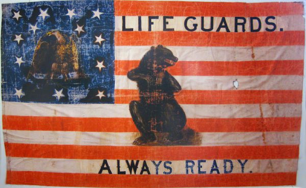
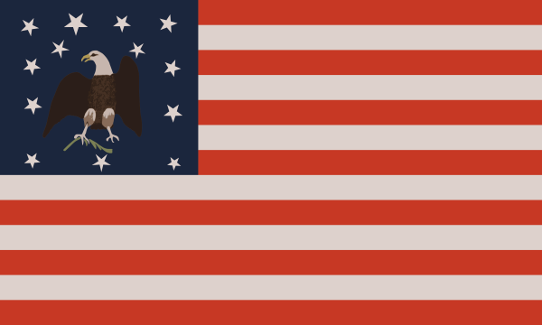
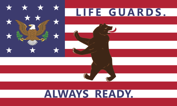
Michael De Groote, in a 2010 Deseret News article, describes an interview with Elder Eldred G. Smith, emeritus patriarch for The Church of Jesus Christ of Latter-day Saints, in which Elder Smith showed De Groote the flag pictured here. (Photograph by David Christenson from a separate interview with Elder Smith.)
Original photograph by David Christenson as posted to his blog: https://davidkat99.blogspot.com/2012/02/presidents-day-and-mormon-battalion.html.
Many refer to this flag as the “Mormon Battalion flag,” and while the description is accurate in that the Mormon Battalion did carry this flag during their march from Council Bluffs, Iowa to Sante Fe, New Mexico and on to Los Angeles, California, the provenance provided by Elder Smith makes clear that this flag had ties to more groups that just the Mormon Battalion.
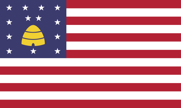
The flag started with the Nauvoo Legion sometime before 1844 in Nauvoo, Illinois. It originally had a beehive in the canton with the thirteen stars. The beehive can be seen underneath the flaking paint in the picture of the original flag.
The Latter-day Saints were driven out of Nauvoo in 1846 and setup a winter camp near Council Bluffs, Iowa as they prepared to migrate west. When the United States Army requested the Latter-day Saints provide conscripts for the Mexican War. The battalion that formed used the Nauvoo Legion flag, but painted an eagle over the beehive. The eagle appears to be holding an olive branch in one talon. Conspicuously missing are the arrows in the other talon.
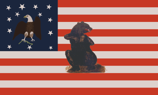
The Mormon Battalion finished their march in California. On July 4, 1847, they raised the flag, now with a bear painted over the stripes, over Fort Moore.
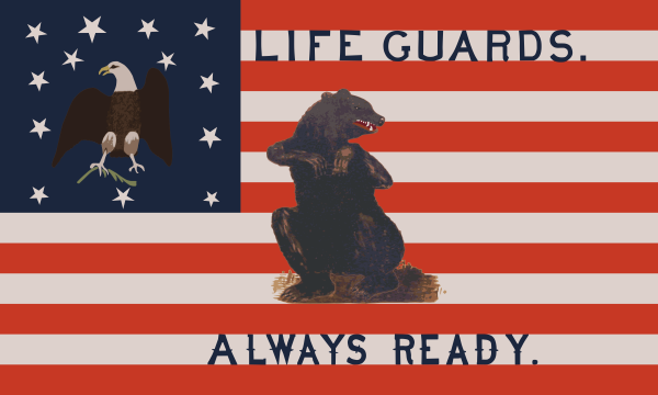
After their service in the Army was complete, many of the battalion travelled to Utah to be establish their homes with the main body of the Latter-day Saints. They presented the flag to Brigham Young, who passed the flag on to his Life Guards. Following common practice of the day, the militia painted their name and slogan, “Always Ready,” on the flag.
From there the flag passed to the Smith family. For more history on the flag, so also the Lee Benson article from 2021.
Rather than a “flag by committee” like we get with many state or municipal flags, where everyone gets to add their two cents, the Mormon Battalion flag represents more of a “flag by progression,” where significant events and transitions are commemorated on the banner.
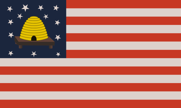
Below are modern reinterpretations of the Nauvoo Legion flag and the Mormon Battalion flag. They use the current color schemes as specified in the United States Flag Code. The charges (stars, beehive, eagle, olive branch, and bear) use common current standards consistent with heraldry.
She is the noble lady
Of the emerald vesture
Who calls to me in dreams.

Through misted moonlight
I have seen
The path that leads
To her glen and loch.
By light of dusk
On shadowed hills
We have there rejoined
Through glimpsing eyes,
Then turned to separate paths.

Now where is Ainé,
Keeper of my visions?

The dreamer of Glendalough,
The noble lady
Miadh Ríoghan.

My friend.
Sun
beats
down.
Bright light;
slights night.
Depart the
wilderness;
desert waste.
Return to the
valley;
forest grove.
Then let the rains fall and cool the scorched soul.